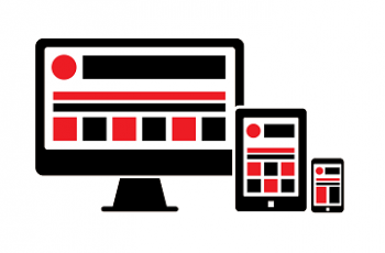
So, what is Responsive Design?
You may not have heard the term “responsive design” before but it’s a subject that is gripping the web development world currently. This is an approach to coding and design that aims to accommodate the growing number of web enabled devices and serve them usable content without having to design & build separate sites for each experience.
This is done essentially through a series of media queries (Huh? Simply put the web site “Queries” the devices display resolution it is being consumed on and then based on that answer instigates a set of rules that dictate the layout, etc) A fluid layout design is developed to accommodate these scenarios.
Why should I be interested?
Well, hold up a sheet of paper in front of half your screen whilst viewing your current website, or stand ten feet away and try and read the content, that’s what your website is going to look like in a few years time to a very large part of your users.
The general consensus is that in the very near future, most people will mainly experience the web on some sort of mobile device (Smartphone, Tablet) than they do on a traditional desktop or laptop. This means your web presence has to accommodate and adapt to this shift if it doesn’t want to be ignored by this large and growing segment of web users.
“Phones are already more popular than PCs. New research by Canalys shows that 2011 global smartphone shipments topped those of client PCs — including desktops, laptops, netbooks, and tablets — for the first time.”
From Canalys. Read full article here:
“Smartphone Sales Will Dwarf PC Sales This Year And Reach A Staggering 1.5 Billion Per Year By 2016.”
From Business Insider.Read full article here:
By optimising your website for your users depending on how they consume it you are removing barriers to conversions and reducing drop out rates. Notable features of Responsive Design include revised navigation methods to make it easier to use the site on smaller screens, reordered content to make reading and journey completion easier, and the ability to add or remove content for different devices, hopefully you’re starting to see the potential here?
For a quick example have a look at http://www.fork-cms.com/ Just grab the bottom right corner of your browser window and close it up and open it again etc, and you’ll see how the content re-orders itself depending on the display space available and remains very useable, you can easily see how this site will look on a narrow Smartphone display.
What are the issues from a client point of view?
As anybody will tell you, you won’t get all that web loveliness above for nothing, currently developing and designing a responsive site is a longer (and for developers and designers a sometimes torturous process) it’s been likened to herding cats or nailing jelly to a wall. What works in one size and orientation may not in another. So the development cycle can take longer. Having said that many new Frameworks have become available recently which enable very stable-cross browser/platform sites to be developed more rapidly these include Twitter Bootstrap (http://twitter.github.com/bootstrap/) and Foundation from Zurb.com (http://foundation.zurb.com/) to name but a few.
How can a web agency demonstrate this responsive concept to clients? Well, traditionally clients may have been presented with static mockups of the sites main pages and wireframes explaining the rest, but this doesn’t convey well the nature and benefits of Responsive Design. Current thinking is to use basic stripped down websites as a kind of HTML wireframe with no branding and simple styling, these help clients see what is happening to content as it is re-sized (and this helps clients see the functionality and user journey better I think). From a visual design point of view the design of static pages will be overtaken by the focus on elements within the page and e.g. Product item area, a Call to Action template, a gallery or light-box display, form elements as well as the basic branding and typography.
What about images, can they be resized to fit different layouts? Short answer, yes and no. Part of the fun of Responsive Websites is that images can be resized automatically in the code, the question is, do you want them to be? The catchall thinking was that images would be resized to fit the width of the device, or containing element below a given resolution by default. But this isn’t always the best option – who wants to see a thumbnail stretched and pixelated across the width of their phone? So there are several ideas around currently, one involves serving different sized images where required at higher resolutions again via media queries. There are also several third party solutions will automatically re-size images and serve them at the correct resolution. Like http://adaptive-images.com/. So careful thought has to be given to use of images particularly in Content Managed Systems.
The future?
The clever bit here, as I mentioned above is that the screen size is being judged, not the device, so in in this sense it is very future proof, if a new device is launched next year, that’s fine as the site will simply query the devices dimensions (and orientation – cool, eh?) and serve up the content as per it’s instructions. For example many new SmartTV’s with web access are arriving on the market, no problem, the responsive web is ready to handle it.
Additionally because we can control how the site changes for different screens, assuming smaller screens are for mobile devices this gives us the opportunity to optimise the interface for touch screen, for example make buttons larger and easier to use, refine shopping carts for easier use on smaller screens, ensure navigation doesn’t take up most of the screen but is still easy to use.
And the good news is that all of this can be done in one go, no longer will you look to have a “regular” website and then look to have a “mobile” version developed at extra cost. Additionally as this is “browser” technology it doesn’t even care if it’s on an Apple or Android device.
The future is bright and it’s going to be in lots of different shapes!